 |
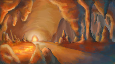
| The update version with bold colours added |
I've decided to make some changes on the Photoshop image that I've finished yesterday using the colour pallete scheme TutorPhil advised and recommended. This helped me alot with bold colours that would be suitable for a cave with hot and cold in the same area. I'm really happy with the rock formations on the right as they look much better with tones than the previous image, it makes the rest of the image stand out. The image still looks soft even though this time I've added more oppacity and the hardness of the brush but at least this time it is a bit easier to see where things are unlike the last image. Apart from that, I'm really happy with the result!! ^_^
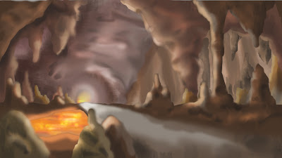 |
| Previous image that I did yesterday |


Nice Joe but be careful here, your in danger of mopping the room with lights. Your use of blue colours to identify heat sources is a good thing to use. There are other colours in the library you should consider (reds for the very edge, green to merge the yellows and oranges with the blue. Think of it in terms of the colour chart, from that you can create a nice depth map.
ReplyDeleteKeep up the good work :)